NEW REPORTING FEATURES IN ACTION!
CREATING A WORD DOCUMENT WITH A BOOKMARK
We have data from the Second National Health and Nutrition Examination Survey (NHANES II) (McDowell et al. 1981). We are interested in how health measures differ across diabetics and nondiabetics. We begin by creating a “Table 1”:
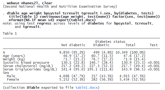
In this table, we see the average weight, systolic blood pressure, cholesterol, and triglycerides for each group. We have also performed a test of equality between diabetics and nondiabetics for the three health measures; we suppressed these tests for age, weight, and sex. With a single command, we are able to create and export this table to a Word-compatible file (table1.docx). However, we wish to include this table in a report along with a graph, text, and other content, which we do below.
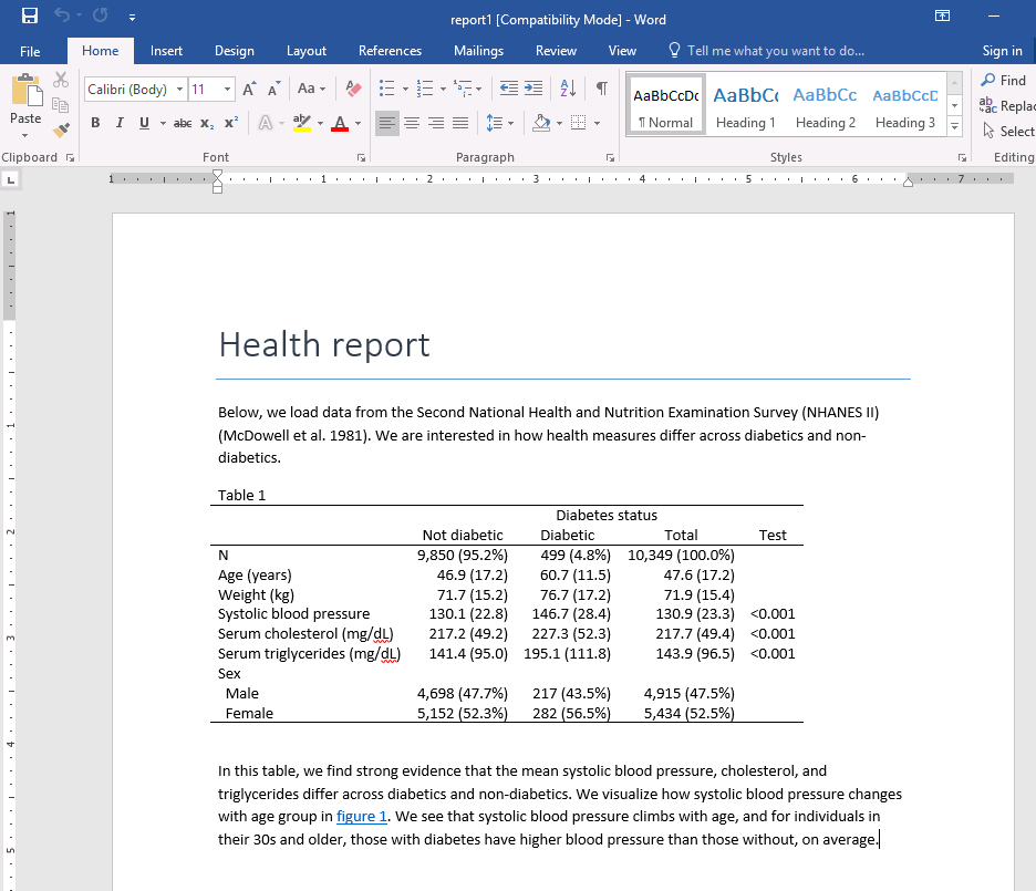
We will begin by creating an active document, adding a title and an introduction to our analysis:
putdocx begin
putdocx textblock begin, style(Title)
Health report
putdocx textblock end
putdocx textblock begin
Below, we load data from the Second National Health and Nutrition
Examination Survey (NHANES II) (McDowell et al. 1981). We are interested in
how health measures differ across diabetics and non-diabetics.
putdocx textblock end
Then, we will include the table we created above, although this time we won’t need the export() option. Instead, we use collect style putdocx to resize the column widths to fit the contents and use putdocx collect to insert the table in our document.
. quietly: dtable age weight bpsystol tcresult tgresult i.sex, by(diabetes, tests)
   title(Table 1) continuous(age weight, test(none)) factor(sex, test(none))
   nformat(%6.1f mean sd)

. collect style putdocx, layout(autofitcontents)

. putdocx collect
(collection DTable posted to putdocx)
Next, we discuss the results of our table and link to figure 1. Although we have yet to create the bookmark called bmark1, we format the text “figure 1” as a link to the bookmark.
putdocx textblock begin
In this table, we find strong evidence that the mean systolic blood pressure,
cholesterol, and triglycerides differ across diabetics and non-diabetics. We
visualize how systolic blood pressure changes with age group in
<<dd_docx_display bookmarklink("bmark1"): "figure 1">>. We see that systolic
blood pressure climbs with age, and for individuals in their 30s and older,
those with diabetes have higher blood pressure than those without, on
average.
putdocx textblock end
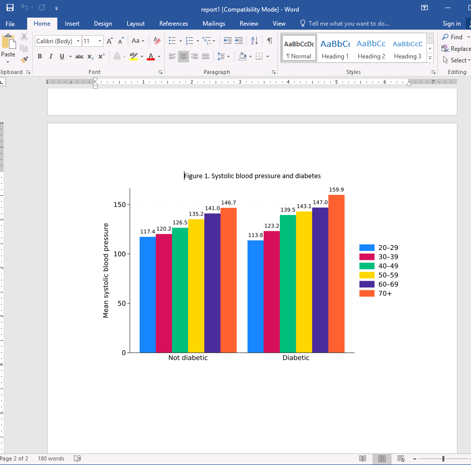
Finally, we create a bar graph to visualize the average systolic blood pressure for each age group and category of diabetes. We export our graph to an SVG file and add a title to the image. The title is “Figure 1. Systolic blood pressure and diabetes”, which we format as a bookmark. Then we export our image by using putdocx image and specify alternative text to be read by voice software. Last, we save our work.
. graph bar (mean) bpsystol, over(agegrp) over(diabetes)
   asyvars blabel(bar, format(%6.1f)) ytitle(Mean systolic blood pressure)

. graph export graph1.svg, replace
file graph1.svg saved as SVG format

. putdocx paragraph, halign(center)

. putdocx text ("Figure 1. Systolic blood pressure and diabetes"),
    bookmark("bmark1")

. putdocx image graph1.svg, linebreak
    alt("Graph of systolic blood pressure and diabetes")

. putdocx save report1, replace
successfully replaced "C:/Users/Stata/report1.docx"
We can see that “figure 1” is a link; once we click on it, we are taken to Figure 1:
CREATING AN EXCEL FILE WITH LOCKED CELLS
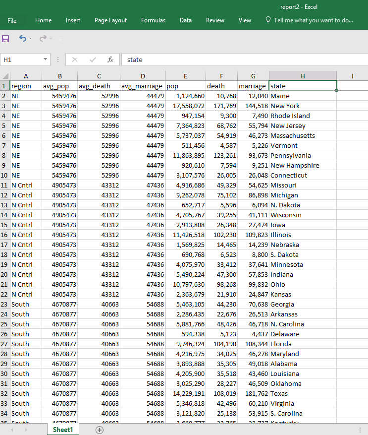
We have data from the 1980 census that we wish to export to an Excel file. We are interested in how the population, number of deaths, and marriages vary across each region of the United States. First, we compute the mean for pop, death, and marriage. We then export our variables of interest to a file called report2.xlsx with export excel. The first row will contain the variable names, and the first four columns will record the region and averages we computed. To modify this file, we use putexcel set with the modify option. We split the worksheet at the first row and the fourth column with option split(1,4). In other words, we lock this row and column to keep the averages in view, while we scroll through the information for each state.
. webuse census, clear
(1980 Census data by state)

. foreach x of varlist pop death marriage {
  2.     bysort region: egen avg_`x' = mean(`x')
  3. }

. export excel region avg_* pop de marriage state using report2.xlsx,
    firstrow(variables) replace
file report2.xlsx saved

. putexcel set report2.xlsx, modify

. putexcel sheetset, split(1, 4)
file report2.xlsx saved

. putexcel save
Here is our resulting document:
We can now scroll down to other regions while maintaining the column names in view and scroll to the right while maintaining the averages in view:
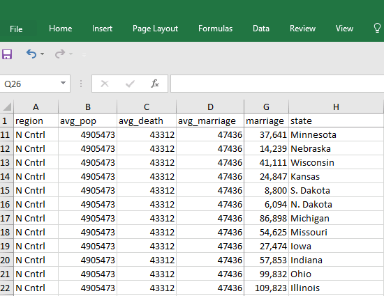
As we scroll down to the North Central region, we see an average of 47,436 marriages per state; Illinois had the most, 109,823.
We might also store summary statistics for each region in one worksheet and hyperlink to the table from another sheet with the new support for hyperlinks. We could customize our worksheet further by including a header, footer, or page break. See [RPT] putexcel for more information.
MATERIALS
You can download the do-file and resulting documents created in the above examples by typing
. copy "https://www.stata.com/new-in-stata/new-reporting-features/files/rpt.do">https://www.stata.com/stata18/reporting-features-do
. copy "https://www.stata.com/new-in-stata/new-reporting-features/files/report1.docx">https://www.stata.com/stata18/reporting-features-report1.docx
. copy "https://www.stata.com/new-in-stata/new-reporting-features/files/report2.xlsx">https://www.stata.com/stata18/reporting-features-report2.xlsx