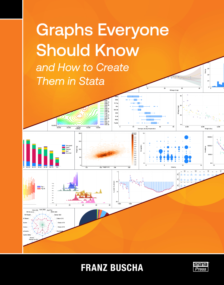
Franz Buscha’s book, Graphs Everyone Should Know and How to Create Them in Stata, is written for anyone who uses Stata to make graphs. Beginners will find a complete collection of tools for effectively visualizing their data and results. Experienced Stata users are certain to learn some new tricks as well.
The chapters of the book are organized into four main sections: graphs for univariate data, graphs for bivariate data, graphs for multivariate data, and special graphs. Each chapter introduces a type of graph, explains when and why it is useful for visualizing a particular kind of data, demonstrates how to create that graph using Stata, and shows a few variations. The special graph section covers topics such as how to create maps, plot equations, create animated graphs, and create other specialty graphs.
Readers will find it easy to learn to make graphs by example. Buscha demonstrates most graphs using datasets that are installed with your copy of Stata, so it is straightforward to follow along. He also clearly pairs each graph with the command used to create it in a box just above the graph. If you find a graph that you wish to create with your own data, you can take the command from the box and replace the variable names in the example with your own variable names.
Buscha’s book has two unique features that distinguish it from other books about Stata graphs. First, the book’s goal is to clearly demonstrate how to effectively visualize different kinds of data and results from models using only necessary features. It focuses on important options but does not discuss all the options available for customizing each graph. Second, the book introduces many community-contributed graph commands that are freely available and can be downloaded from the internet. Readers may be unaware of these commands before finding them in this book, and they can learn how to use them quickly rather than spend time trying to write custom code for themselves.
Graphs Everyone Should Know and How to Create Them in Stata is a reference you will use again and again as you visualize different types of data. You will quickly find the graphs that are applicable to your data and the Stata commands necessary to create them.
1.2 A basic histogram
1.2.2 Changing the y axis
1.2.3 Bar labels
1.2.4 Added density plots
1.3 Spike plots
1.4 Histograms with varying bin widths
1.5 Multiple histograms
1.6 Mirrored histograms
1.7 Ridgeline histograms
2.2 A basic kernel density plot
2.2.2 Bandwidth choices
2.2.3 Kernel choices
2.3 Cumulative distribution plots
2.4 Multiple kernel density plots
2.5 Mirrored kernel density plots
2.6 Ridgeline kernel density plots
3.2 A basic box plot
3.3 Horizontal box plots
3.4 Box plots with histograms
3.5 Multiple box plots
4.2 A basic violin plot
4.3 Horizontal violin plots
4.4 Multiple violin plots
4.5 Custom widths
5.2 A basic dot plot
5.2.2 Adjusting marker size
5.2.3 Dot plots without binning
5.3 Multiple dot plots
5.4 Horizontal dot plots
5.5 Beam plots
5.6 Dot plots with box plots
5.7 Cumulative dot plots
6.2 A basic stem-and-leaf plot
6.3 A graphical stem-and-leaf plot
6.4 A horizontal stem-and-leaf plot
6.5 Mirrored stem-and-leaf plots
7.2 Symmetry plots
7.3 Skew plots
7.4 Quantile-uniform plots
7.5 Quantile-normal plots
7.6 Quantile χ plots
7.7 Quantile–quantile plots
8.2 A basic rootogram
8.3 Hanging rootograms
8.3.2 Confidence intervals
9.2 A basic frequency bar chart
9.3 Percentage bar charts
9.4 Horizontal bar charts
9.5 Sorted bar charts
9.6 Multiple bar charts
9.7 Dot charts
10.2 A basic pie chart
10.2.2 Labeling pie charts
10.2.3 Exploding pie charts
10.2.4 Sorting pie charts
10.3 Multiple pie charts
11.2 A basic radar chart
11.3 Multiple-radar charts
11.4 Radar charts with too few or too many categories
11.5 Frequency radar chart
12.2 A basic scatterplot
12.3 Scatterplots with multiple y and x variables
12.4 Scatterplots over categorical groups
12.5 Scatterplots with marginal distributions
12.6 Binned scatterplots
13.2 A basic heat plot
13.2.2 Custom colors
13.2.3 Custom bins
13.2.4 Proportional bin sizes
13.2.5 Scatter heat plots
13.3 Hex-heat plots
13.4 Sunflower plots
14.2 A basic line plot
14.2.2 Multiple line plots
14.2.3 Line plots with markers
14.2.4 Different connecting styles
14.2.5 Multiple y axes
14.2.6 Unsorted, sorted, and missing data
14.2.7 Line graphs with arrows
14.3 Sparkline plots
15.2 A basic area plot
15.2.2 Important area plot options
15.3 Data with variation
15.4 Shaded range plots
15.5 Pair plots
15.6 Multiple area and shaded range plots
16.2 A basic best fit plot
16.3 Quadratic fits
16.4 Fractional polynomial fits
16.5 Multiple lines of best fit
16.6 Custom polynomial fits
16.7 Multiple custom polynomial fits
16.8 Custom polynomial fits with functions
16.9 Constrained lines of best fit
16.10 Nonparametric fits (smoothers)
16.10.2 Other bivariate smoothers
16.11 Lines of best fit with confidence intervals
16.12 Multiple lines of best fit with confidence intervals
16.13 Lines of best fit with recast confidence intervals
17.2 A basic jitter plot
17.3 A complex jitter plot
17.4 Jitter plots with continuous values
18.2 A basic table plot
18.2.2 Complex table plot
18.2.3 Framed table plot
18.3 Three-way table plot
18.4 Balloon plots
19.2 A basic two-way frequency bar chart
19.2.2 Column, row, and cell percentage two-way bar charts
20.2 A basic two-way stacked frequency bar chart
20.3 Two-way stacked percentage bar chart
20.4 Slide plots
20.5 Mosaic plots
21.2 Correlation matrix
21.3 Matrix scatterplots
21.4 Multiple matrix scatterplots
21.5 Cross plots
21.6 Trellis plots
22.2 A basic contour plot
22.3 Contour-line plots
22.4 Contour plots with custom colors
22.5 Contour plots with small and incomplete datasets
23.2 A basic trivariate heat plot
23.2.2 Trivariate heat plot scaled color fields
23.2.3 Trivariate heat plot with a categorical x variable
23.2.4 Trivariate heat plot with discrete y and x variables
24.2 A basic bubble plot
24.2.2 Bubble plot with different symbols
24.2.3 Bubble plot over multiple groups
25.2 Basic Chernoff faces
25.2.2 Chernoff half faces
26.2 A basic triplot
26.2.2 Multiple triplots
27.2 A basic 3D scatterplot
27.2.2 Modifying markers
27.2.3 3D scatterplots over groups
27.3.4 A note on large datasets
27.3 3D scatterplot without autoscaling
27.4 3D surface plots
28.2 A basic animated graph
29.2 A basic rainbow plot
29.3 A complex rainbow line plot
29.4 A complex rainbow box plot
30.2 Visualizing coefficients from one regression
30.3 Plotting coefficients from two regressions
30.4 Plotting coefficients from four regressions
30.5 Plotting coefficients from a regression with an interaction term
31.2 A basic geographic map
31.3 Choropleth maps
31.4 Submaps
32.2 A basic mathematical function
32.3 A custom equation
32.4 A statistical function
32.5 Polynomial regression terms
© Copyright 1996–2026 StataCorp LLC


