INTRODUCTION
Minimum GAUSS version: 14.0
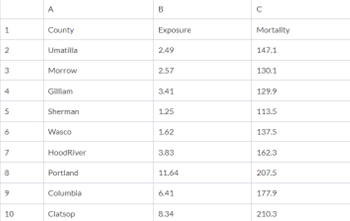
In this tutorial, we will draw a scatter plot of some data from an Excel® file containing measurements of nuclear site exposure and cancer mortality for a few counties in Washington state. You can download the Excel® file here.
The contents of the data file look like this:

STEP 1: LOAD THE DATA
We will start by loading the exposure and mortality columns into a GAUSS matrix. First save the hanford.xls file that you downloaded from the link above to your computer and set your GAUSS working directory to the folder in which you saved the Excel® file. Then load the data with the following command:
- GAUSS 18+
// Load all data from the variables
// 'Exposure' and 'Mortality'
data = loadd("hanford.xls", "Exposure + Mortality");
- GAUSS 16+
// Load all data from columns B2:C10
// into a GAUSS matrix named 'data'
data = xlsReadM("hanford.xls", "B2:C10");
- older versions
// Load all data from columns B2:C10
// into a GAUSS matrix named 'data'
data = xlsReadM("hanford.xls", "B2:C10", 1, "");
Now data should be a 9×2 GAUSS matrix where the first column is the exposure data and the second column is the mortality data. Let’s create two new GAUSS matrices, one named exposure and one named mortality, to make the code more readable.
// Create a new matrix 'exposure' containing
 // all observations from the first column of 'data'
 exposure = data[.,1];

// Create a new matrix 'mortality' containing
 // all observations from the second column of 'data'
 mortality = data[.,2];
STEP 2: CREATE A BASIC SCATTER PLOT
We are wondering if our data shows a relationship between nuclear exposure and cancer mortality. A scatter plot is a good way to attempt to visualize this relationship. We can create a simple scatter plot of our two variables like this:
 // Create scatter plot
 plotScatter(exposure, mortality);
After running the code above you should get an image that looks similar to this:
STEP 3: CUSTOMIZE THE PLOT
Our initial graph seems to show a relationship, which makes the data more interesting. Next, we need to customize this graph a bit so that when we share this graph with others, they can understand what it represents.
Our first graph used the default settings for scatter plots. You can view and modify those graphically by selecting Tools > Preferences > Graphics from the main GAUSS menu. It is often desirable, however, to customize your graph as part of a program so that it can be easily replicated. That is our focus for this tutorial.
THE PLOTCONTROL STRUCTURE
A plotControl structure holds all of the settings for creating a GAUSS graph. To use a plotControl structure we need to:
- Declare a variable to be an instance of a
plotControlstructure.
© 2025 Aptech Systems, Inc. All rights reserved.
- Fill this
plotControlstructure with the default values, using the function plotGetDefaults. - Apply our desired changes with the
plotSetfunctions. - Pass the
plotControlstructure to the plotting function.
 /*
 ** Step 1:
 ** Declare 'myPlot' to be an instance of a 'plotControl' structure
 */

struct plotControl myPlot;

/*
 ** Step 2:
 ** Fill 'myPlot' with the default values for a scatter plot.
 ** Valid options include: bar, box, contour, hist, scatter,
 ** surface and xy.
 */

myPlot = plotGetDefaults("scatter");

/*
 ** Step 3:
 ** Apply our desired plot attributes with the 'plotSet' functions
 */

// Set the title and title font
 plotSetTitle(&myPlot, "Nuclear Exposure vs Cancer Mortality", "Arial", 16);

// Set the label for the X-axis
 plotSetXLabel(&myPlot, "Exposure");

// Set the label for the Y-axis
 plotSetYLabel(&myPlot, "Mortality");

/*
 ** Step 4:
 ** Pass the 'plotControl' structure to 'plotScatter'
 */

// Draw scatter plot with settings from 'myPlot'
 plotScatter(myPlot, exposure, mortality);
After the code above, our updated plot should look more like this:
THE PLOTSET FUNCTIONS
The plotSet functions modify the settings inside of the plotControl structure that you are using.
The first argument to each of the plotSet functions is going to be a pointer to your plotControl structure. This allows the internal elements of the plotControl structure to be modified inside of the plotSet function.
While a pointer to a structure may sound difficult or arcane‐‐all you need to know is that you need to place an ampersand & in front of the structure name. Fortunately, the function tooltips will remind you.

The remaining inputs should be more straightforward and will be documented in the Command Reference entry for each function. Let’s use plotSetTitle as an example. It takes the following inputs:
- &myPlot
- A pointer to a
plotControlstructure.
- A pointer to a
- title
- String to display as the graph title.
- font
- Optional input. String, the name of the font to use for the title.
- fontSize
- Optional input. Scalar, the size of the font in points.
- fontColor
- Optional input. String, the name of font color.
Note that the inputs inside of the square brackets [] are optional inputs.
CONCLUSION
In this tutorial, we learned
- How to draw a basic scatter plot, passing in only our X and Y vectors to plotScatter.
- How to programmatically customize a scatter plot by using a
plotControlstructure.


