Galbraith plots
Highlights
Summarize meta-analysis results
Assess heterogeneity
Detect potential outliers
Galbraith plots are a graphical way to present the story of your meta-analysis. They give information about the study-specific effect sizes, their precisions, the overall effect size, and detecting potential outliers. They also let us assess heterogeneity among the effect sizes.
Let’s see it work
We will use the bcgset dataset of Colditz et al. (1994). This dataset has already been declared as meta data using meta esize. The BCG vaccine is used to prevent tuberculosis (TB). There are a total of 13 studies in the meta-analysis. For each study, subjects were randomly assigned to either a control group or a treatment group where they received the vaccine. The effect size of interest is the log risk-ratio of contracting TB.
. webuse bcgset
(Efficacy of BCG vaccine against TB; set with -meta esize-)
Suppose you performed a meta-analysis, and you would now like to summarize your results graphically. The forest plot is a popular option. The Galbraith plot is yet another option. The Galbraith plot reports information about the study-specific effect sizes and their precisions, reports the overall effect size, and helps detect potential outliers. It also provides guidelines to assess heterogeneity among the effect sizes.
We use meta galbraithplot to produce a Galbraith plot:
. meta galbraithplot
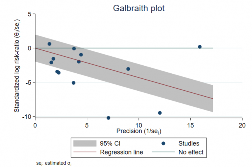
Let θ̂ j and σ̂ j represent the study-specific effect size and its standard error. The navy circles represent a scatterplot of the study-specific standardized log risk-ratios, θ̂ j/σ̂ j, against study precisions, 1/σ̂ j. Studies that are close to the y axis have low precision. Precision of studies increases as you move toward the right on the x axis.
The green reference line (y = 0) represents the “No effect” line. If a circle is above the reference line, the risk in the vaccinated group is higher than the risk in the control group for that study. Conversely, if a circle is below the line, the risk in the treatment group is lower than the risk in the control group. Only two studies reported a higher risk of contracting TB in the vaccinated group (a positive log risk-ratio, or a risk ratio that is greater than 1).
The red line is the regression line through the origin. The slope of this line equals the estimate of the overall effect size, which is the overall log risk-ratio in our example (equal to −0.454). Also, the slope of an imaginary line from the origin to an individual circle is equal to the effect size (log risk-ratio) estimate corresponding to that circle. In our example, the regression line is sloping downward, meaning that the overall risk ratio is less than 1, which also means that, overall, the vaccine reduced the risk of TB in the vaccinated group.
In the absence of substantial heterogeneity, we expect around 95% of the studies to lie within the 95% CI region (shaded area). Here 6 out of the 13 studies were outside the shaded region, which indicates considerable heterogeneity among the effect sizes.
Potential outliers may be studies that lie farther away from the shaded regions. Let’s mark these potential outliers on the Galbraith plot. In the graph below, we label four studies as potential outliers. These studies correspond to a standardized log risk-ratio (_meta_es/_meta_se) that is less than −4 or to a precision that is larger than 15.
. quietly generate lbl = string(trial) if _meta_es/_meta_se < -4 | 1/_meta_se > 15 . meta galbraithplot, mlabel(lbl) mlabpos(12)The Galbraith plot is a useful tool to assess heterogeneity and detect potential outliers. To quantify the impact of these potential outliers on the estimation of the overall effect size, see Leave-one-out meta-analysis.

